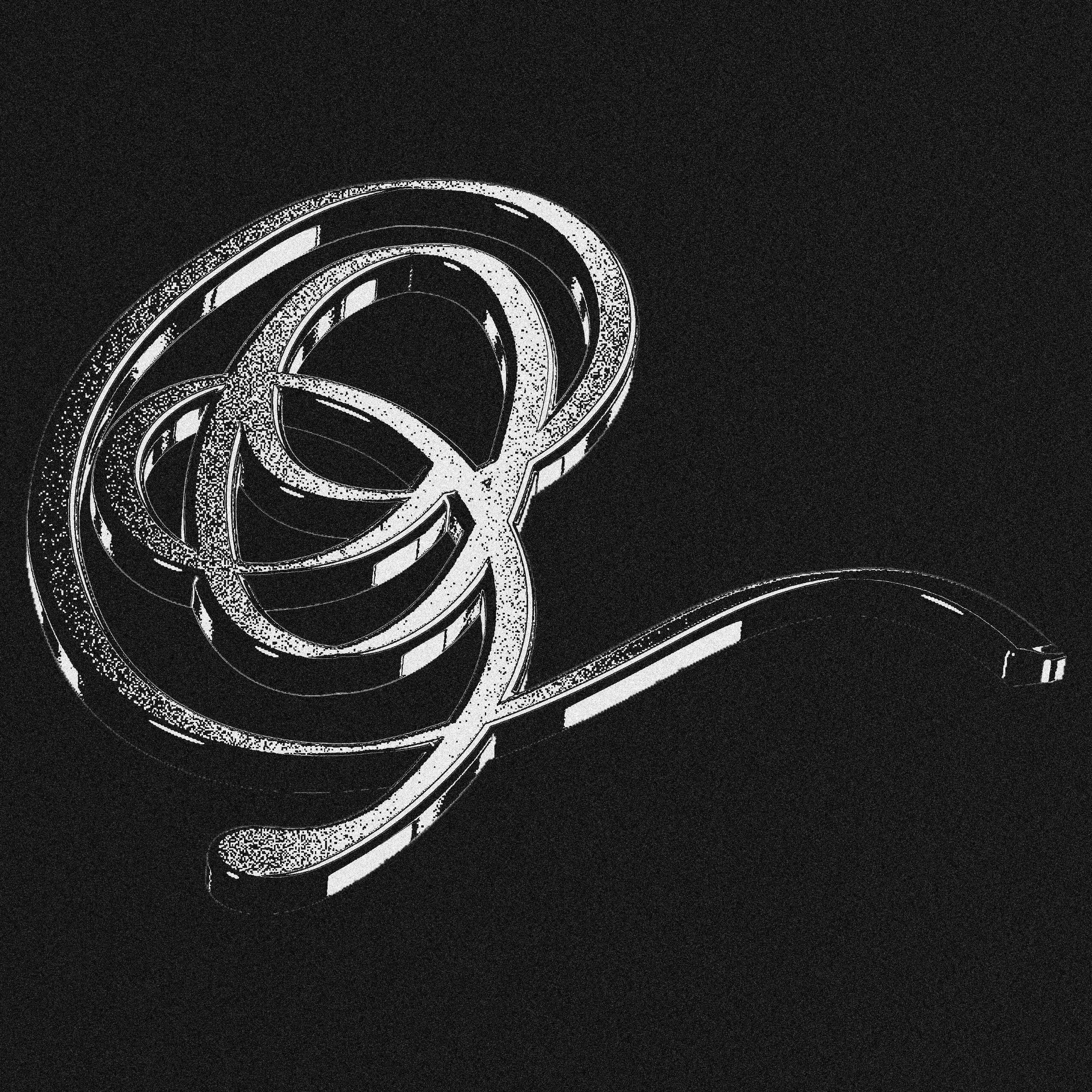
YWDY RIBBON
︎︎︎ Personal Work
The idea here is to develop an artistic display typeface. The type is ostentatious and overlaps forming a sort of lattice designed to engage the viewer/reader. My hope is that this presents a challenge for the reader to try and discern each letter and in turn the whole title.
2021+
2021+
Every element of the typeface’s anatomy [ascender, swash, loop, stem, etc...] has intentionally identical widths to cause a little confusion and prompt the reader to map out each letters sequence.

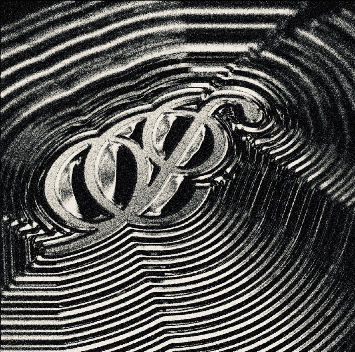
CHROMETYPE POSTERS of letters ‘N’ ‘O’ ‘P’